Very often at work, I used to get bombarded with user-interface related questions. Some of those would be ones I would be hunting tangible answers for myself. Typical ones would be:
“Does this website look good?”
“Which interface looks better?”
“Should I place the button to the left or to the right?”
“Do I keep the logo Green or Red?”
Now, the problem every time was the expectation to offer perfect answers, along with supporting reasons. Although my intuition helped me get through on a few, the part I would struggle most was in offering convincing reasons to support my answers. I felt my supposed intuition had some underlying logic and concepts but I needed to reify those. I needed to have constructs that I could use to easily judge any Design, be it a web page, mobile application UI or even a poster.
What followed was a lot of google search, expert advice seeking and directionless research. Finally, I came across a course based on Design Thinking which paved the way to a whole new perspective of looking at any design.
I now use a personal knowledge kit, heuristics of sorts, that I have been able to develop, courtesy this course, which helps me analyze any User Interface. If you are facing similar problems, this blog should be of help. So here are the points:
……………………………………………………………………………………………………
1. Evaluate your Work
Before making an Interface public, make an evaluation yourself by asking these questions:
How easily can someone
- Determine the function of the system and possibilities?
- Determine the mapping from the intention of the user to actual operation?
- Perform the action?
- Tell the state of the system? Tell if the desired action has been completed or not?
- Determine the mapping from the state in which the system is into what the user understands?
If all the questions have already been addressed in your design, then you’re good to go. If not, then you need to enhance one or some of the aspects listed below to make the User Interface better i.e. providing
- Visibility and Feedback
- Consistency
- Non-destructive operations (undo)
- Discoverability (menus)
- Reliability
- And events should not happen randomly
All these points sum up to nothing but an implementation of the following statement
“Immediate feedback on actions AND Continuous representations of objects” – This is what lies at the core of the best designs that are made.
2. Understanding Mental Models
Even before a user starts performing an action, a mental image is formed in the user’s mind which depicts the user’s understanding of the Interface, which is called the Mental model. Very often a user thinks something and the system does something else, which leads to this gap between the mental model of the user and the designer.
This can be overcome by experimenting with multiple beta users and analyzing how your interface performs. Additionally, through our Interface, we can provide a good idea of how each object works and how to control it leading to the Interface itself disclosing how it is used.
3. Representation Matters
This lays emphasis on just one thing – What to show and What not to.
Representation plays a significant role in simplifying or complicating matters, and so, a Good Representation shows all of the relevant information, and nothing else.
Use pictures where words seem monotonous. As the saying goes, ‘A picture is worth a 1000 words’, the same principle can be used to build great interfaces. It takes time for the user to read and make a mental image and then process the information. This time can be cut out be using images directly and where ever they can be in the UI. Icons facilitate visual recognition and come handy when you know what something looks like but not what it’s called.
Some other factors that are often ignored are Whitespaces and Contrasts. Important information can be delineated by smart use of spaces and contrasts.
4. Typography
Typography is defined as “The art and technique of arranging type to make written language legible, readable, and appealing when displayed”
Something to be aware of when working with text-based applications is the Serif Hypothesis, which states that “Serif is easier to read as the letters contain anchors and tails which provide comfort to human eyes while reading texts for extended duration of time”
So, if you have a lot of written content on your webpage, you now know which text format to consider.
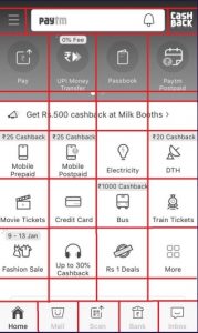
5. Layout
Every UI is designed with Grids in Mind. For example, have a look at the pictures below :
Paytm Home Page
Yahoo Home Page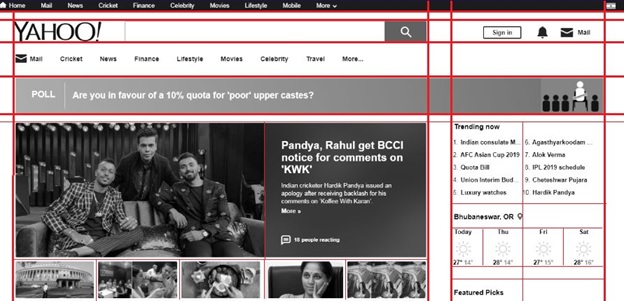
Things to be kept in mind are :
- Alignment guides the eye and so we should avoid glitches there.
- We automatically and unconsciously notice patterns/deviations that fall out of place.
- That is why it is very important that we stick to mathematically accurate patterns.
- In case we decide to deviate from a pattern, it has to be strategical.
- Use visual proximity and scale to convey semantic information
6. Color
Effective use of colors can enhance the user experience to a great level. Colors can be used to highlight essential elements on the screen or to direct user attention.
Now, each color is associated with a certain meaning that has been proven over the years in various studies. The emotions that various colors invoke are as follows:
- Red — Symbolizes lust, power, excitement or love
- Yellow – Competence and happiness
- Green – Good taste, envy
- Blue – Masculine, high competence, high quality corporate
- Pink – Sophistication, sincerity, feminine
- Purple – Royalty, authority, sophistication, power
- Brown – Ruggedness, earthiness, toughness
- Black – Grief, sophistication, expensive, fear, evil
- White – Happiness, sincerity, purity
These are widely agreed notions that will not change anytime soon.
7. Positioning
Users automatically pay attention to certain elements basing on their position on the webpage. More often than not, they seem to define a trend in which a webpage is viewed.
Neilsen Norman Group came out with a heatmap after conducting research on human eye tracking on webpages.
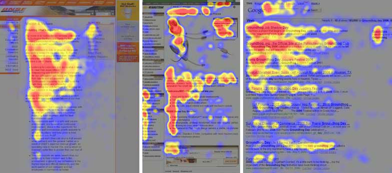
The highly colored area shows the highest density of the user eye views. That is where most users looked at most of the time. This just means one thing to us: put the more important content in that high-density area.
Now let’s look at the simplified pattern for a web page: This image shows the optimum positioning of information on a webpage based on the level of importance.
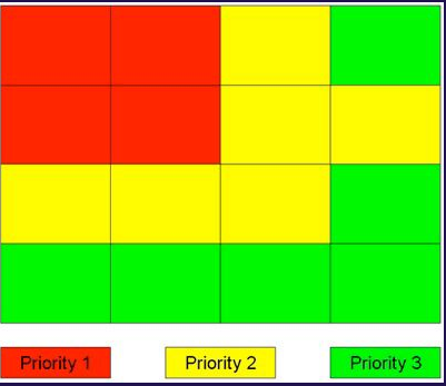
Important stuff needs to be in Priority 1 blocks followed by others.
Credit: Poynter Institute www.poynter.org/extra/eyetrack2004
……………………………………………………………………………………………………
The views and opinions expressed in this article are those of the author. To know more about our company, please click on Mindfire Solutions.